Annual report design for TPG Telecom

Building meaningful relationships and supporting vibrant, connected communities

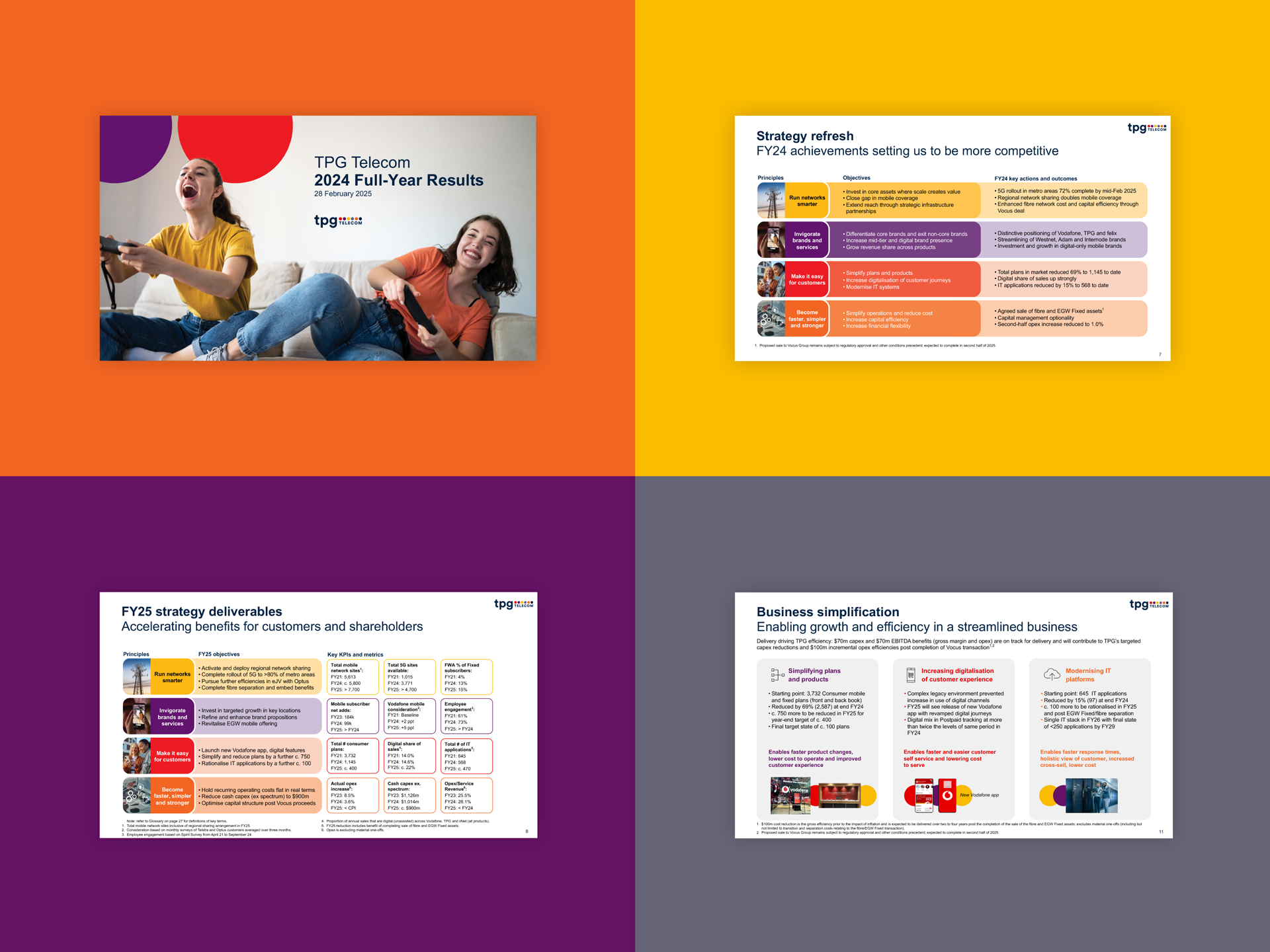
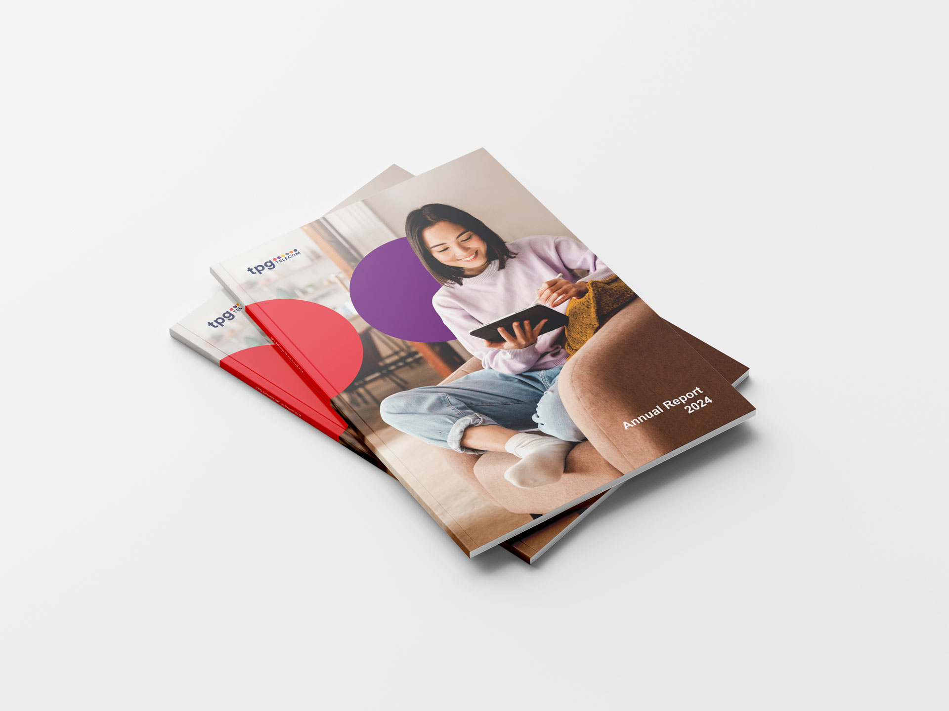
Annual Report Full-Year Results Presentation Corporate Governance Statement Tax Transparency Report Workiva design assistance

TPG Telecom is home to some of Australia’s most-loved brands including Vodafone, TPG, iiNet, AAPT, Internode, Lebara and felix. They own and operate nationwide mobile and fixed networks that are connecting Australia for the better.

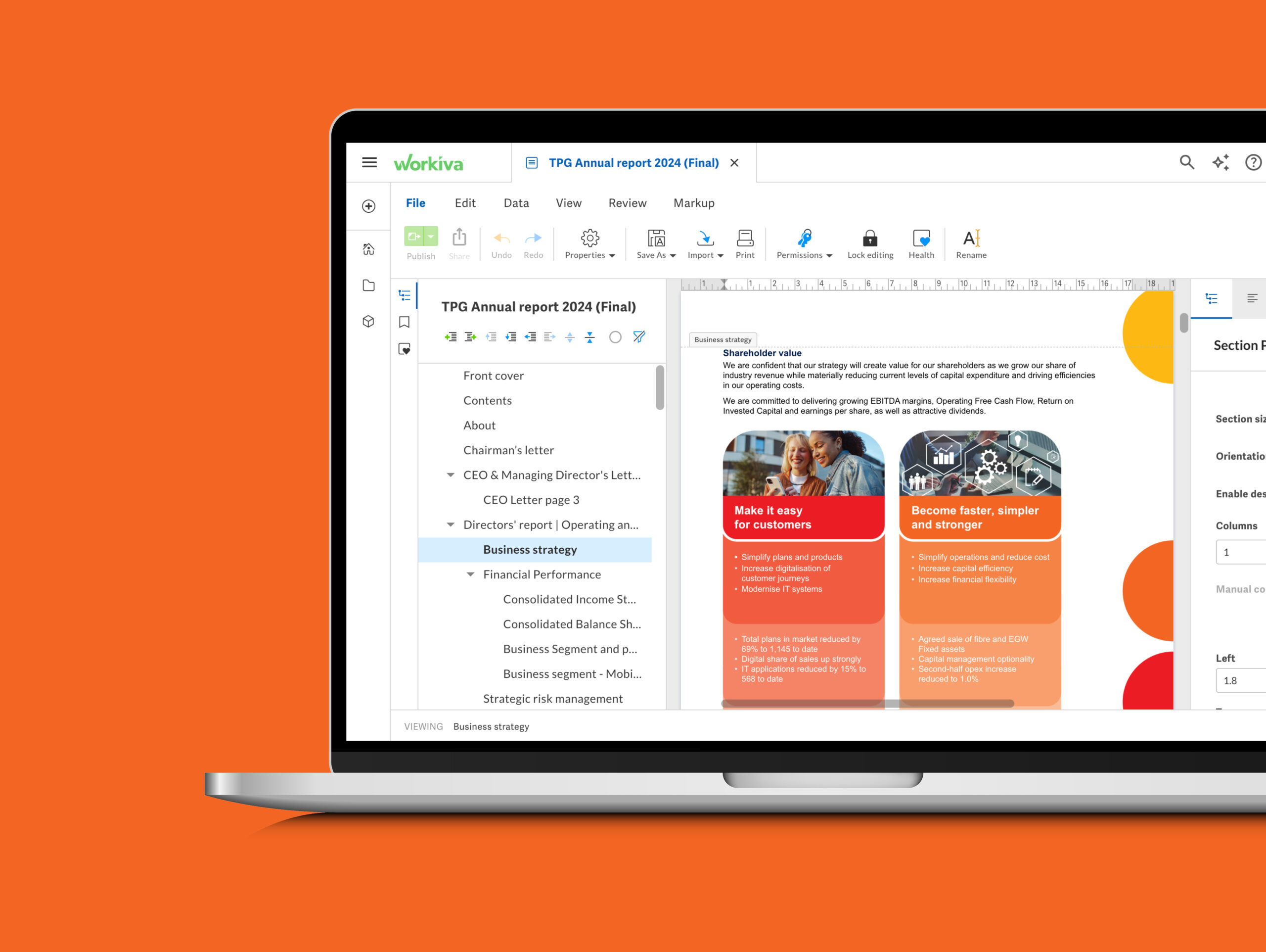
We have worked with TPG Telecom since 2021, assisting with the design and development of their Corporate Reporting Suite. During our first year working together, we assisted with streamlining their reporting processes and exploring different technologies and platforms that would best suit their internal processes and workflows and in 2024, we transitioned them to the Workiva platform. Learn more about our Workiva Designed Reporting expertise here. 

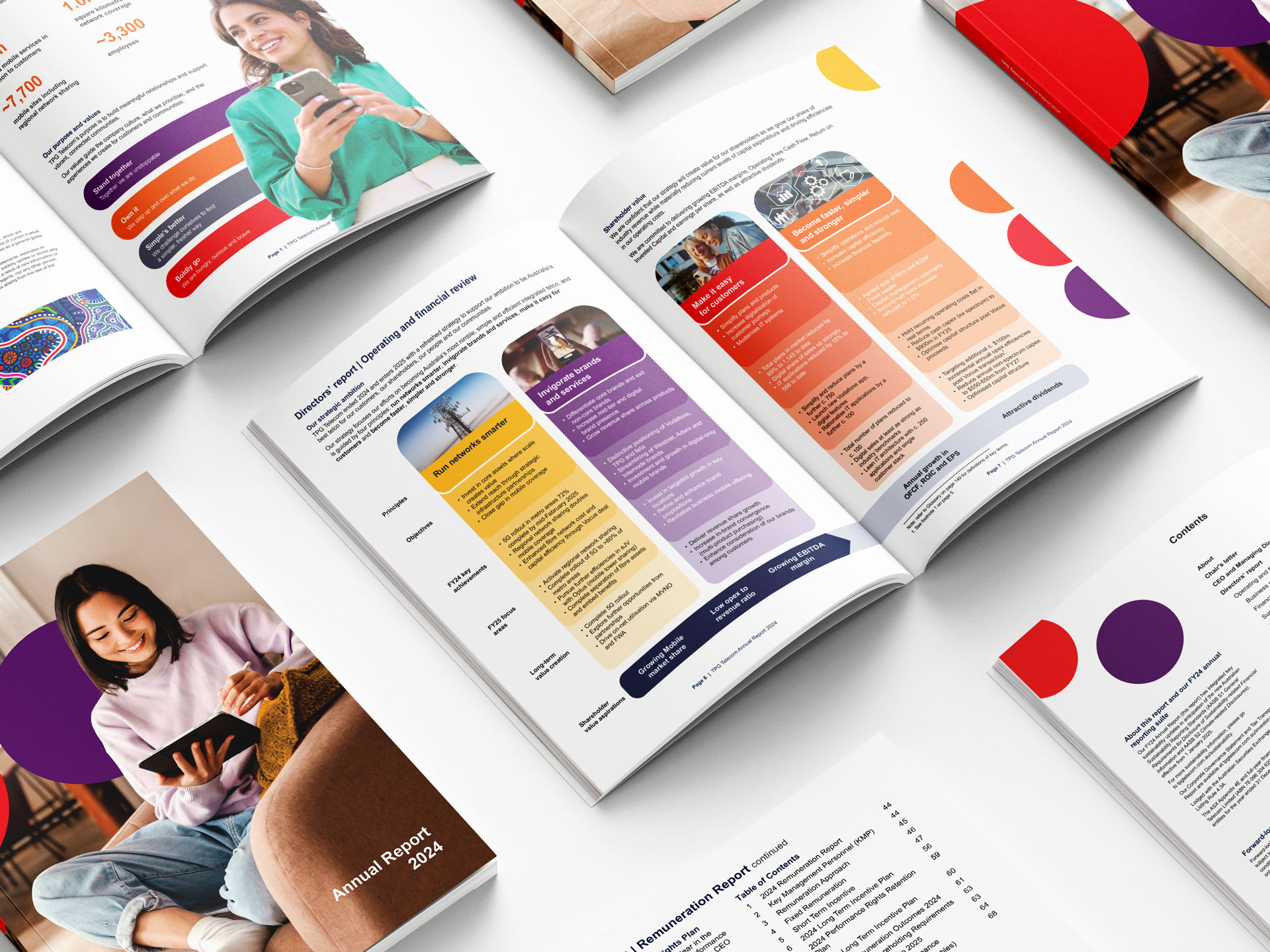
Each year, we leverage their visual identity, featuring a symbolic dot pattern (derived from their logo) to represent the union of their different brands – a sum of parts working better together. Combined with photography that heroes their people, their reporting suite focuses on visually communicating their purpose of building meaningful relationships and supporting vibrant, connected communities.

Overview

TPG Telecom is home to some of Australia’s most-loved brands including Vodafone, TPG, iiNet, AAPT, Internode, Lebara and felix. They own and operate nationwide mobile and fixed networks that are connecting Australia for the better.

We have worked with TPG Telecom since 2021, assisting with the design and development of their Corporate Reporting Suite. During our first year working together, we assisted with streamlining their reporting processes and exploring different technologies and platforms that would best suit their internal processes and workflows and in 2024, we transitioned them to the Workiva platform. Learn more about our Workiva Designed Reporting expertise here. 

Each year, we leverage their visual identity, featuring a symbolic dot pattern (derived from their logo) to represent the union of their different brands – a sum of parts working better together. Combined with photography that heroes their people, their reporting suite focuses on visually communicating their purpose of building meaningful relationships and supporting vibrant, connected communities.
More case studies

View all

Looking for a full-service design agency that delivers?

Get in touch