walterwakefield assisted WorleyParsons’ strategic rebrand as part of the Jacobs ECR acquisition.
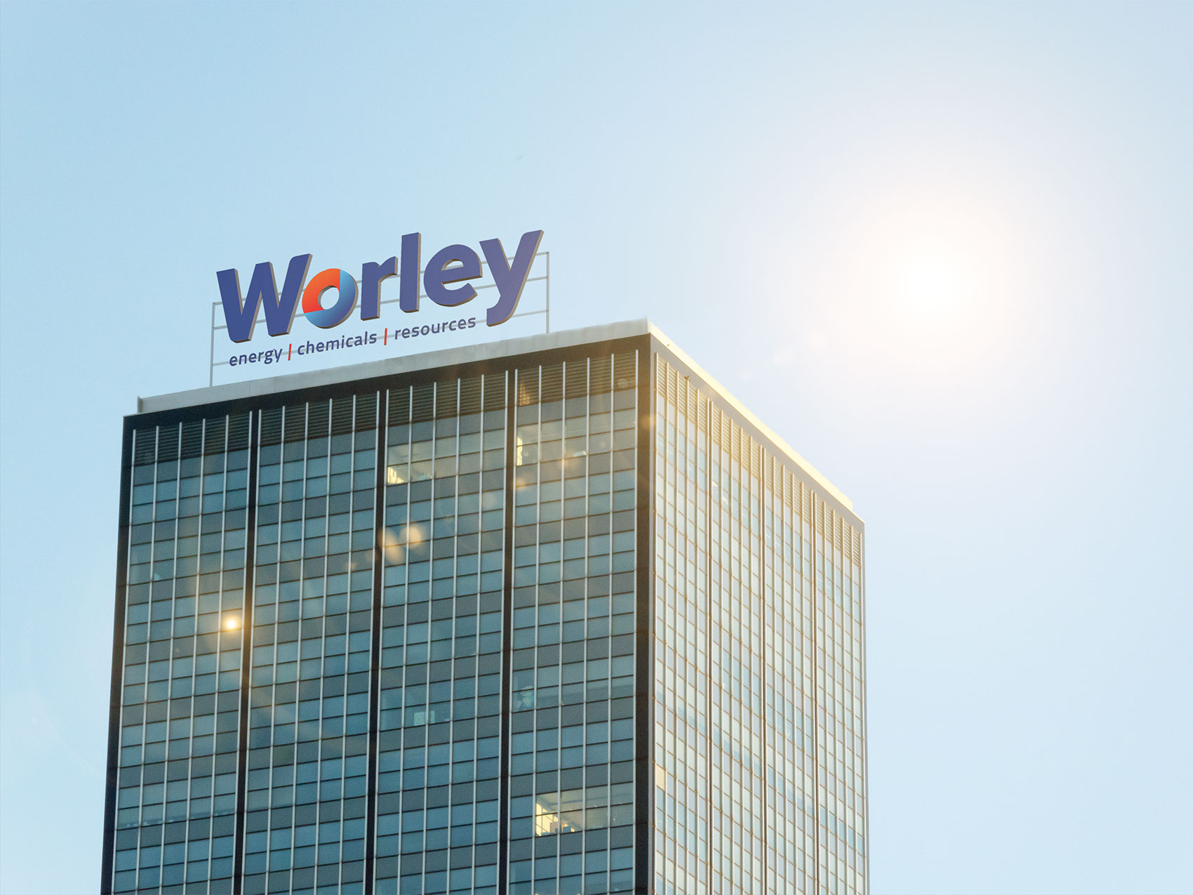
WorleyParsons returns to the roots of its brand by dropping “Parsons” from its name, changing from the current red and black logo to blue and red.
The merger of WorleyParsons and Jacobs ECR brings together more than just their assets. It brings together different perspectives, insights, capabilities and expertise for the benefit of Worley’s customers and the industries in which they work.
The “O” in the new logo contains a subtle “J” to pay homage to the Jacobs’ name. The brand adopts the blue from Jacobs and retains a small touch of red from its heritage, and inserts “chemicals” to its energy and resources tagline to reflect the strengthening of the chemicals business.
This new merger positions Worley as the pre-eminent global provider of professional project and asset services in energy, chemicals and resources and increases their exposure to the North American energy market, including oil and gas refineries. With greater operations in North America, the Middle East and India this brings the global staff count to approximately 57,600.
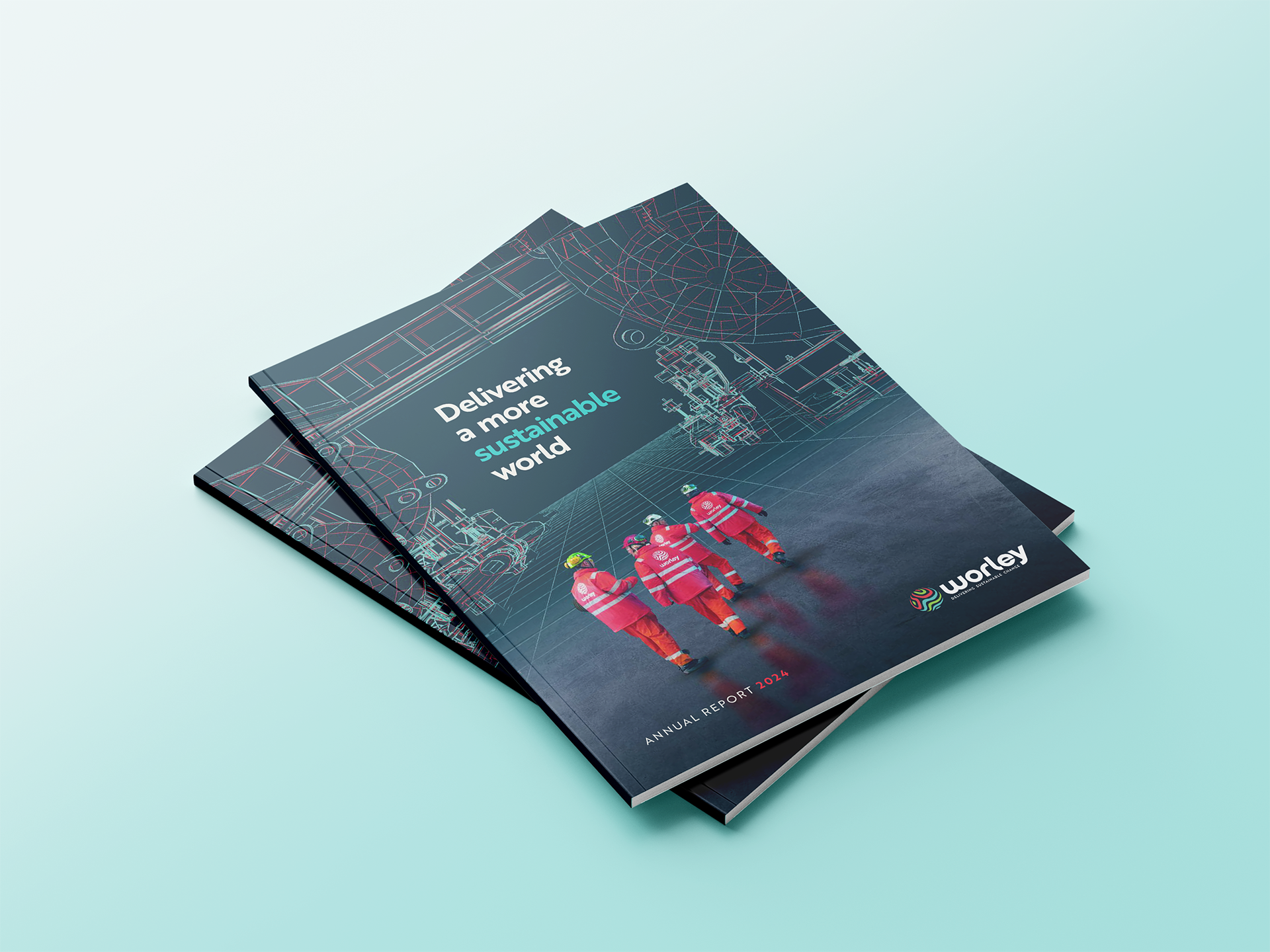
walterwakefield have advised Worley on brand strategy, architecture, naming, brand identity and management since the year 2000.