What
Originally, “above the fold” is a graphic designers’ theory and term that refers to a remarkable news story or a photograph likely to appeal to people on the upper half of the front page of a newspaper.
Today, it means in the immediate viewport of your device, where the content is seen without or before scrolling.
Why
The reason you may consider creating longer pages and putting content below the fold is that you have something to explain, whether it’s your brand strategy, product or service offering.
The alternative is to put all this content on pages other than the homepage. However, from a user experience perspective, scrolling is better than clicking and research supports this. Often, a website user won’t go beyond the homepage to find information.
From a technical standpoint, a more extended page is also better. While you read the content above the fold, content is being pre-loaded below the fold, unlike bouncing out to whole new pages which will only start loading when a user lands on them.
Scrolling is a continuation; clicking is a decision”
– Josh Porter, UX Legend
When
In the 90s, you would explain as much as possible “above the fold” and have a “call to action” button to dive deeper into other pages.
You made a decision favouring clicks over scrolling. However, the research going back to 1998 shows that users prefer scrolling to clicking. Scrolling was a pain point, but less than clicking.
As the Page Scrolls
Then, the long “explainer” pages came along. Think about how Apple launch their products and take you on a journey, using a long page with multiple panels for each cool feature, specification and beautiful visualisation of the product.
The issue isn’t whether the call to action is visible. The issue is whether your call to action is visible at the point where someone has become convinced to take action.
– Luke Wroblewski (Usability guru) There Is No Fold
How
As often is the case, it’s about the “how”. Not all long pages are made equal, and some are designed better than others.
Luckily, a lot of UX research has been done to help us put in all the right tools, hints and affordances for the user to firstly know that they need to scroll and secondly to make it easy for them to do so.
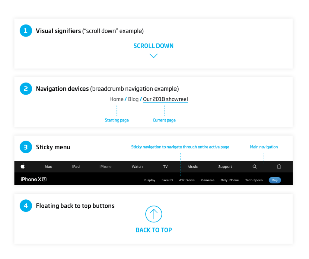
Here are just some measures a designer can take:
- Address the “illusion of completeness”. Use visual signifiers to tell the user that there is something below the fold, such as an arrow with “SCROLL DOWN” text.
- Use navigation devices such as a progress bar on the side or a breadcrumb navigation.
- Use sticky menus with anchors to the various sections in the long page.
- Use floating back to top buttons.
Research
|
of attention on a standard media page is spent below the fold. |
Eye-tracking studies confirm that people do scroll if designers use certain guidelines. |
|
In 2011, Apple removed the scrollbar from Mac OS X. This shows that people are so familiar with scrolling that they don’t need the visual clue for it. |
participants almost always scrolled, regardless of how they are cued to do so – and that’s liberating” Everybody Scrolls, |
|
Most clicks and engagement happens right at and below the fold. |
Users can read long, scrolling pages faster than paginated ones. The Impact of Paging vs. Scrolling on Reading Online Text Passages |
Conclusion
Long pages are engaging and increasingly more interacted with by users but need to be well designed. They have seen more popularity in the modern world, hence are more accepted. Mobile devices helped users embrace scrolling, as clicking and waiting for a page to load is even more frustrating when on the run.
Research even shows that more clicks and interactions happen below the fold, as the user becomes more convinced to take action.
There Is No Fold
Also consider that even when you have a long page, users don’t have to scroll. Long pages still need to be designed with prioritisation of content. The main message and the truncated version of your homepage along with the CTA can live above the fold. As a bonus, you can offer more content below the fold, for the ‘curious’ or advanced user. Have all the content on this page also readily available in the main navigation.


